Introduction
Typography is more than just selecting fonts – it is the foundation of effective visual communication. Whether you are crafting a brand identity, designing marketing collateral, or building a user-friendly website, mastering typography can transform how audiences perceive and engage with your message. In this blog, we delve into the essentials of typography, uncovering its principles, trends, and commercial value.
Looking to elevate your designs with professional typography? Explore Datum Creative Media’s bespoke design services today!
What is Typography and Why Does it Matter?
Typography is the art and technique of arranging type to make written language legible, readable, and visually appealing. It encompasses typefaces (commonly referred to as ‘fonts’), spacing, alignment, and hierarchy. These elements collectively shape how your message is communicated.
Typography is pivotal in visual communication. A well-designed typographic layout can capture attention, convey tone, and evoke emotion. For commercial brands, typography becomes a critical tool in creating a memorable identity, reinforcing brand values, and ensuring consistency across touchpoints.
The Principles of Effective Typography
Successful typography adheres to certain principles that guide design decisions:
- Balance: Achieving a harmonious layout by distributing visual elements evenly.
- Contrast: Differentiating text elements using size, weight, or colour to create visual interest.
- Hierarchy: Establishing a clear order of importance to guide the reader’s eye.
Readability and legibility are equally vital. Readability refers to how easily text can be read in context, while legibility concerns the clarity of individual characters. Both are essential for effective communication in design.
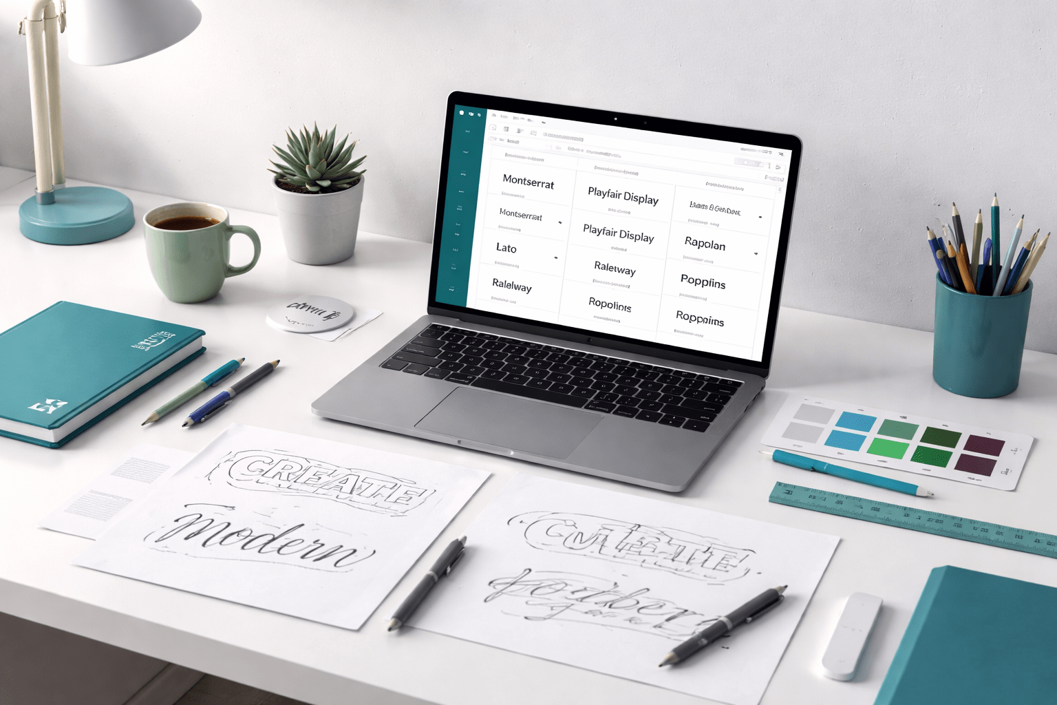
Choosing the Right Fonts for Design Projects
Fonts play an integral role in shaping a design’s tone and functionality. Here are key considerations:
- Font Classifications: Understand the difference between serif (traditional, professional), sans-serif (modern, clean), script (elegant, decorative), and display fonts (attention-grabbing).
- Brand Tone: Align font choices with your brand’s personality. For instance, a luxury brand may favour serif fonts, while a tech company might opt for sans-serif.
Avoid common mistakes such as overloading designs with multiple font styles, using overly decorative fonts for body text, or neglecting compatibility across devices.
Typography Trends in Commercial Design
Staying current with typography trends ensures your designs remain relevant. In 2023, some key trends include:
- Variable Fonts: Offering flexibility in weight and style within a single font family.
- Retro Influences: Nostalgic typefaces that evoke a vintage aesthetic.
- Minimalist Approaches: Clean and simple typography that prioritises functionality.
While trends can be exciting, balance is key. Aim to blend timeless design principles with contemporary influences to meet evolving consumer expectations while maintaining brand longevity.
The Commercial Value of Strong Typography
Typography is more than an aesthetic choice – it drives measurable business outcomes. Consider these examples:
- A rebrand featuring clean, modern typography increased user engagement for a digital platform by 25%.
- Consistent typography across marketing channels boosted brand recognition for a retail brand, leading to a 15% rise in conversions.
Strong typography differentiates brands in crowded markets, creating a professional image that resonates with audiences and fosters trust.
Practical Tips for Using Typography in Design
Here are actionable steps to refine your typography:
- Testing: Preview typography choices across devices and mediums to ensure readability.
- Tools: Leverage resources like Google Fonts, Adobe Fonts, or typography plugins for inspiration and implementation.
- Consistency: Use a typography checklist to evaluate alignment, spacing, and font sizes across designs.
Consistency not only reinforces your brand identity but also enhances the user experience.
FAQs
- What is the difference between fonts and typefaces? A typeface is a family of fonts (e.g., Arial), while fonts are specific weights, styles, or sizes within that family (e.g., Arial Bold).
- How do I choose the right font for my brand? Consider your brand’s tone, audience, and purpose. Test different options to find a font that aligns with your identity.
- What are the most common typography mistakes? Overusing decorative fonts, ignoring readability, and inconsistent application across designs.
- How does typography impact accessibility in design? Accessible typography ensures legibility for all users by considering font size, contrast, and spacing.
Conclusion
Mastering typography is an essential skill for creating impactful designs. By understanding its principles, choosing the right fonts, and staying attuned to trends, you can elevate your brand’s visual communication and achieve tangible business results.
Ready to transform your designs? Discover how Datum Creative Media can bring your vision to life with expert typography solutions.